

If you are reading this article, you have probably experienced problems with the mobile adaptation (mobile usability errors) of your website or you want to find out if your website meets Google’s stringent requirements for mobile websites and how to check it.
Why mobile usability is so important to your site?
After recent updates of Google’s indexing algorithms, one of the very important factors affecting the position of a page in the search engine is compatibility with mobile devices such as smartphones or tablets.
Search service providers have noticed the trend that more and more internet users are coming from mobile devices.
Currently, it is estimated that over 50% of all internet traffic comes from mobile devices. This is a significant change compared to 2000, where mobile device traffic was only about 10% of overall network traffic.
It is not surprising that search service providers have come to the conclusion that websites adapted to mobile devices should be promoted when the search is done out directly from a mobile device.
To achieve this goal, two separate versions of the search index have been introduced, one designed only for mobile devices and the other for the rest, i.e. desktop computers.
In practice, it looks like that by searching the same phrases in the same location of the mobile device we will get different results than searching for the same password from a desktop computer. Pages that are adapted to mobile devices are promoted and presented much higher than pages not adapted to mobile devices when we run a voice or text search on a mobile device.
The natural consequence of this is that SEO and SEM specialists make efforts to customize websites for mobile devices. The main purpose of this action is to increase the amount of organic traffic from mobile devices. This is crucial if we realize that the number of mobile users is constantly growing.
How to check that my site is not mobile friendly
If you are not a technical person the simplest way to audit your website and check mobile combability status is to use free tool called Google Search Console.
On this page we will we show you the way how to install (verify) it on your page or shop.
After you successfully add your page to Google Search Console and wait a few days – you can exanimate the major problems with your site in the section Enhancements / Mobile Usability
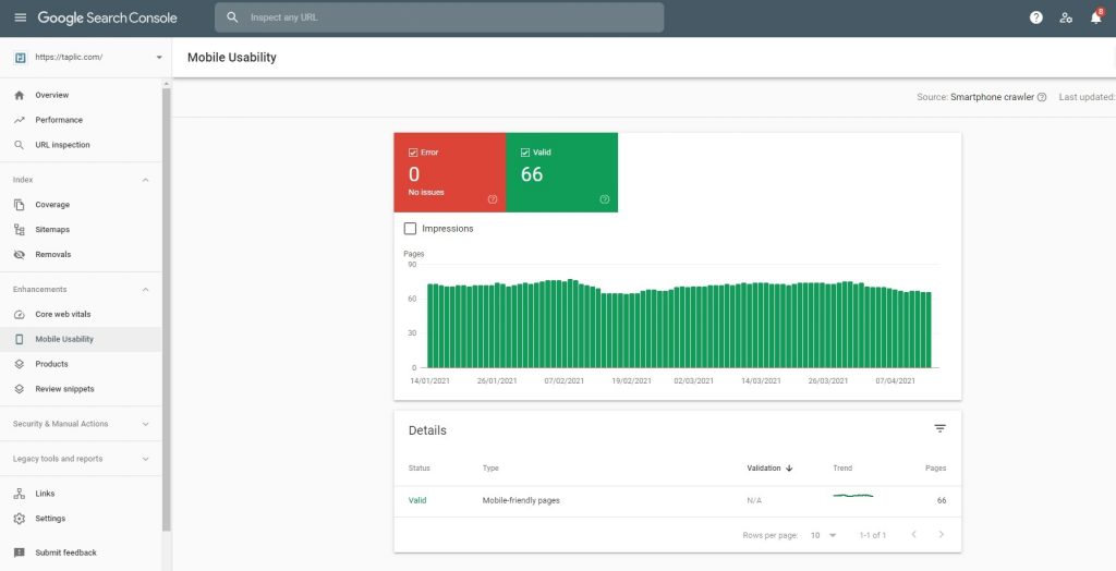
GSC will show you the total number of pages that are valid and the number of detected problems. You should always fix your mobile usability errors because it affects your SEO scoring.
How to fix Mobile Usability Errors in Google Search Console?
Many people ask us if they can fix problems with displaying the website for mobile devices on their own.
While checking our website is relatively easy thanks to GSC, the corrections and adapting the website to the mobile version unfortunately require technical work, most often related to the coding of the website.
However, there are some exceptions and situations where you will be able to fix the mobile usability problem by yourself.
Solution 1: Replace theme to RWD
If your website was built on the basis of a CMS system, e.g. the popular WordPress – it may turn out that it is enough to replace the main graphic theme of the website with one that is compatible with mobile devices.
In general, you should look for a theme marked as RWD.
RWD means such a way of designing a theme so that the website displays well on various devices – small and large. It is acronym for Responsive Web Design.
Solution 2: Ask your web software provider for update
If you do not use an open CMS and bought it from a software supplier – you can check if it has a newer version that is compatible with mobile devices and RWD.
Perhaps your provider will provide periodic updates and you won’t have to pay extra.
Solution 3: Hire webmaster expert to optimize the page
If the first two solutions cannot be used – then most likely you will have to hire a web specialist who will make the necessary changes to the source code of the page.
The number of possible problems related to adapting the website code to mobile devices is very complex.
For this reason, it is very important to choose an experienced partner who knows how to carry out the next stages of optimization in the most effective way.
Based on our experience and several dozen completed projects – we have described the most common problems and ways to deal with them later in this article.
It is worth getting acquainted with this material to have knowledge of what to require from the employed specialist.
How to optimize website for mobile version?
Answering the question What is the optimization of a website for a mobile version, one should realize that Google, which is a giant in the search engine market, has published guidelines for webmasters working on adapting their website to mobile devices.
In Google documents, we can find information that in order for a page to be considered adapted to mobile devices, several key elements related to page creation, its construction, size of resources, etc. should be taken into account.
Fonts , images and space between clickable elements
One of the basic elements deciding about using a website as a mobile friendly is the visibility of the elements viewed on a mobile device.
The mobile page must not contain too small fonts, content and pictures that are very close together, which prevents a natural receipt of their content.
In general, the page may not look like this in order to read it you had to use the zoom function, i.e. zoom on the phone or tablet, or scroll horizontally
Images presented on the mobile page should be scaled to the width of the device screen and the font size should automatically adapt to the resolution and density of pixels on the screen of the device.
Page loading speed and amount of data downloaded from the server
Another equally important factor affecting the quality of a mobile page is the loading time and amount of data that must be downloaded for the page to be displayed.
Although today’s mobile devices have increasingly more powerful CPU and are able to process larger amounts of data, they undoubtedly have less computing power than modern desktops that are equipped with hardware-optimized web browsers.
Thus, the amount of data downloaded to a mobile device and the size of scripts processed on the phone or tablet side significantly affects the page loading time and the overall impression of using it.
This phenomenon is much less visible when using a computer or laptop.
Therefore, it is recommended that the mobile versions be light – in the sense of the amount of data, so that they load in the shortest possible time.
Unnecessary and large images or animations should be replaced with smaller thumbnails and large Java script libraries should be minimized, compressed and used only for the necessary needs of the mobile version of the site.
It is also recommended to use new graphics formats with higher compression, the use of which guarantees a smaller amount of data necessary to download from the server.
It is also recommended to use techniques called lazy image loading, which means that the page does not load all the images that are on it right away. Instead, the images are loaded only when the user scrolls the screen to where the image is visible.
Mobile site implementation techniques
Basically there are two methods for performing a mobile page optimization.
The first of them, which is a bit out of the question, consists in the fact that we create two separate versions of the website and using the script that recognizes the device we are dealing with during loading, we choose one of the versions.
It can be a desktop version for computers and a mobile version for mobile devices. In this situation, we have two completely separate versions of the page, which can look completely different and present completely different content.
The second much more popular and more often used method is the preparation of pages in the so-called responsive technology.
It consists in the fact that we have one source code of the website and one version of the website, which, however, looks completely different on a desktop computer than on a mobile device.
For example, the classic – a horizontal, three-column or two-column arrangement visible on a computer-type device – in the mobile version it is “broken” and presented vertically thanks to the technology “changing the layout of the page on the fly”.
If the same page is created on a mobile device using responsive technology is much more convenient for programmers and webmasters because we are dealing only with one page and not two that should be updated in parallel.
In general, responsive site versions also save server disk-space and reduce the amount of data needed to load a page.
Modern libraries for generating responsive views such as bootstrap help webmasters prepare pages in responsive technology in fast and efficient way.
The responsive technology also allows you to hide some elements in the mobile version, change their sizes etc.
RWD technology is recommended by Google as the proper way to provide web versions adapted to mobile and tablet devices.
Is website optimization always possible?
Basically yes, any website code is mobile adaptable, but the financial aspect is worth considering.
If your website or online store is huge and made in very old technology – in extreme cases it may turn out that website optimization could be very expensive.
In such case it is better and cheaper to rewrite it for a new engine / technology compatible with mobile devices.
Please contact us if you need a quote for website optimization or rewrite to mobile version